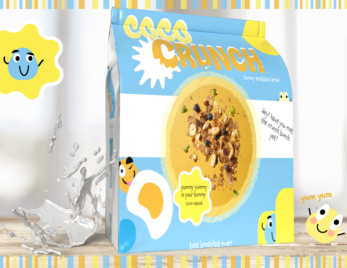
A new breakfast cereal launch, the colours selected are that of a bright morning ,waking up to a sunny day. It also needed to be fun for kids so I created some characters to make this playful for them whilst eating a nutritional breakfast.

Sample Packaging
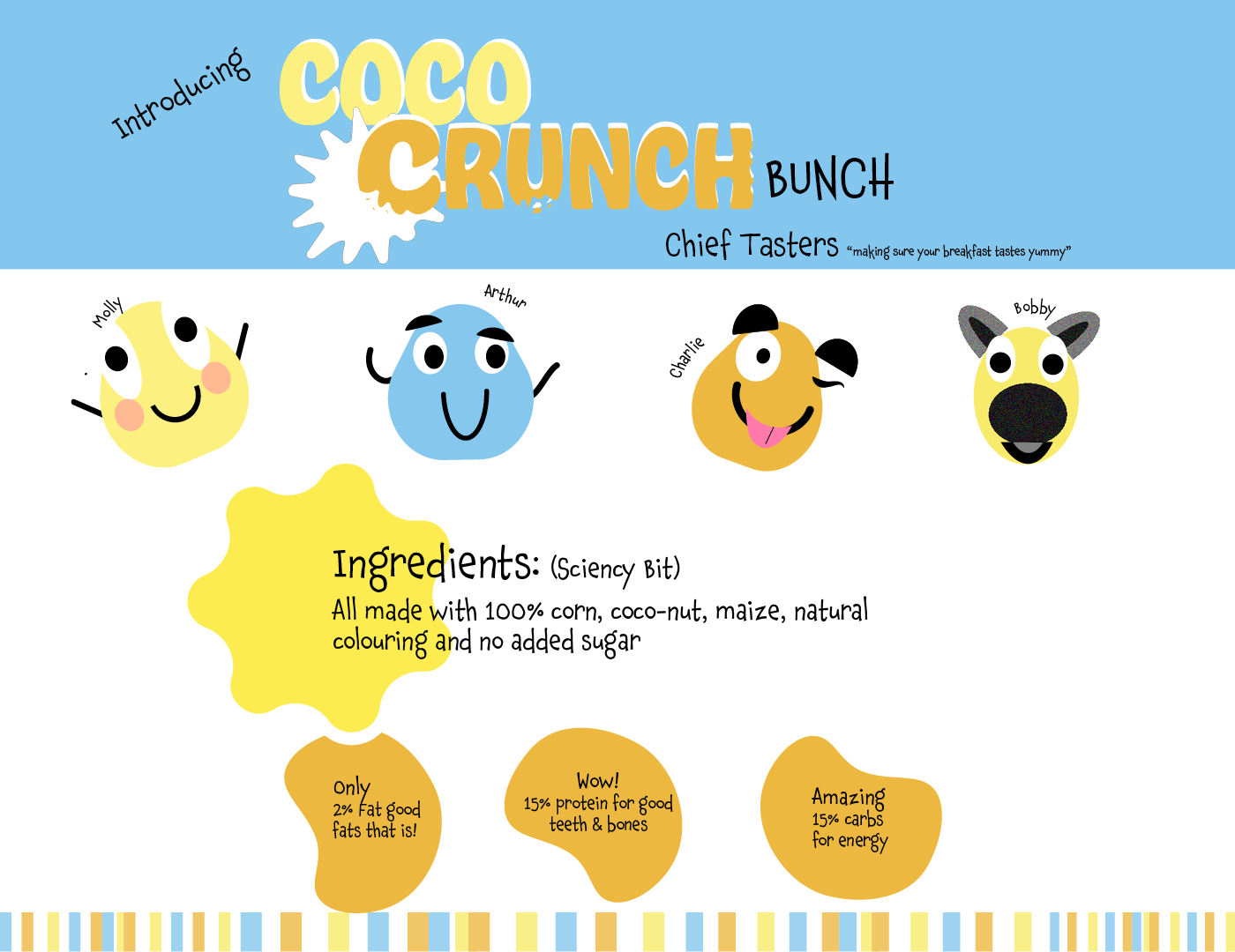
Meet the crunch bunch characters
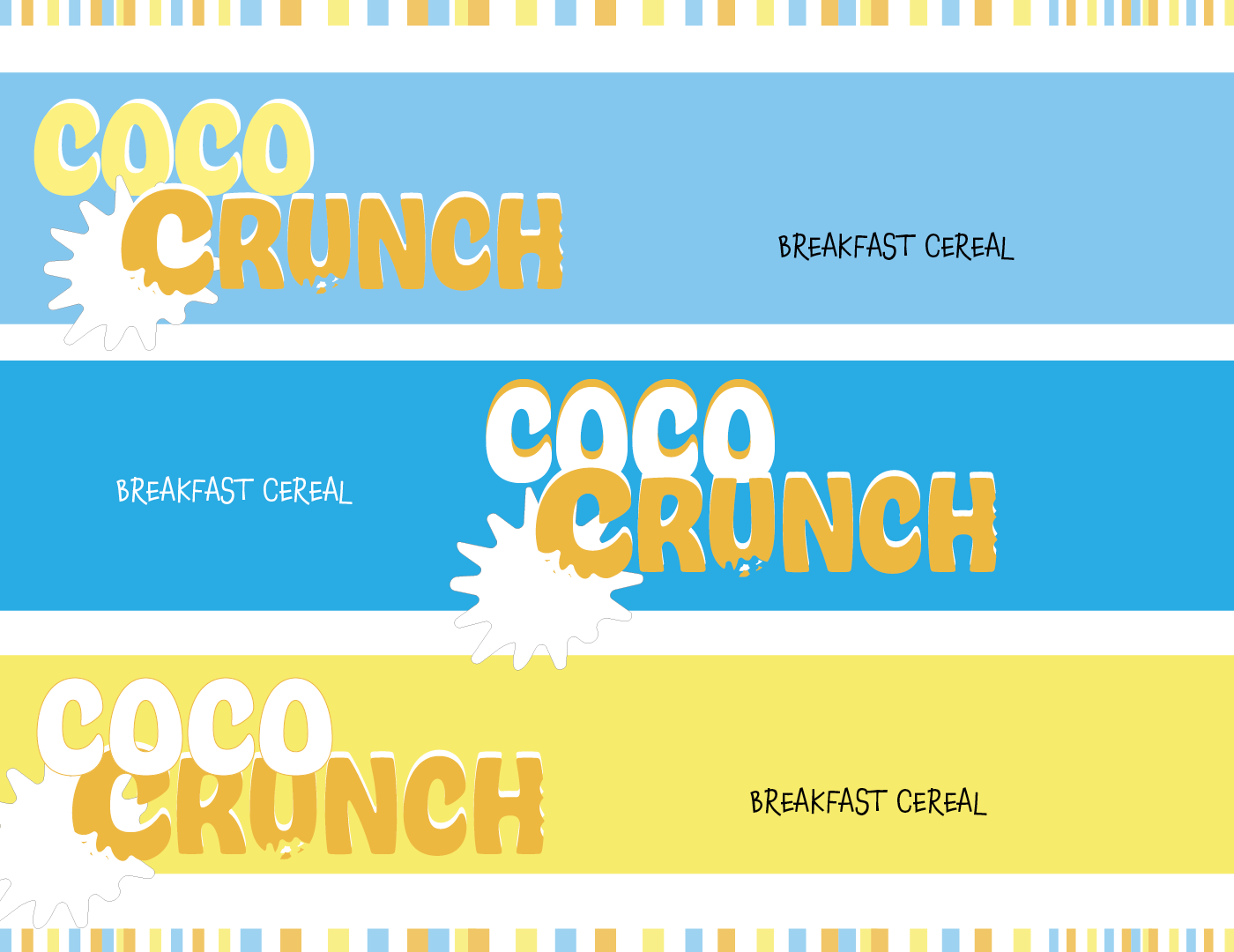
Below are examples of font colour variations - top one was best option I believe as it popped more, albeit the bright blue also stood out for me. Font chosen for main logo was a thick curvy character set as easy to take chunks out as if they were real cereal pieces. The secondary font was chosen for its playfulness its very child like and has an element of fun to it.