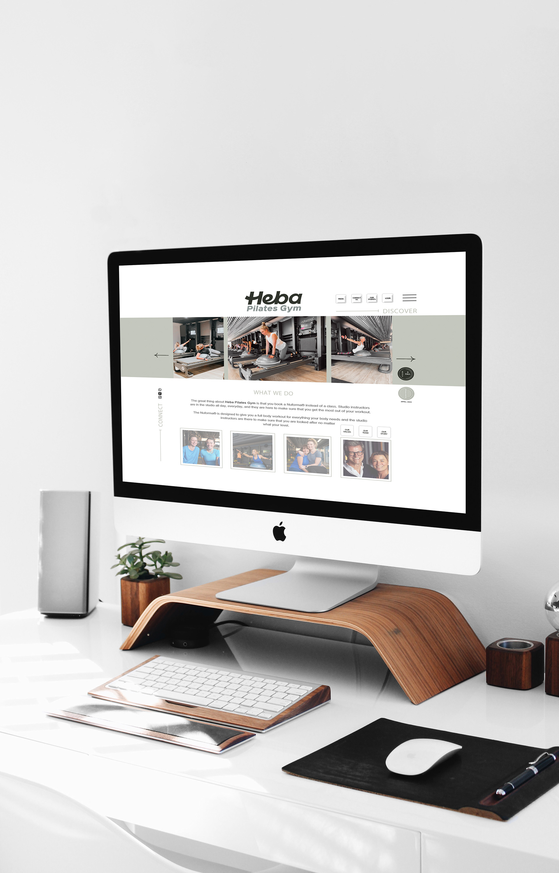
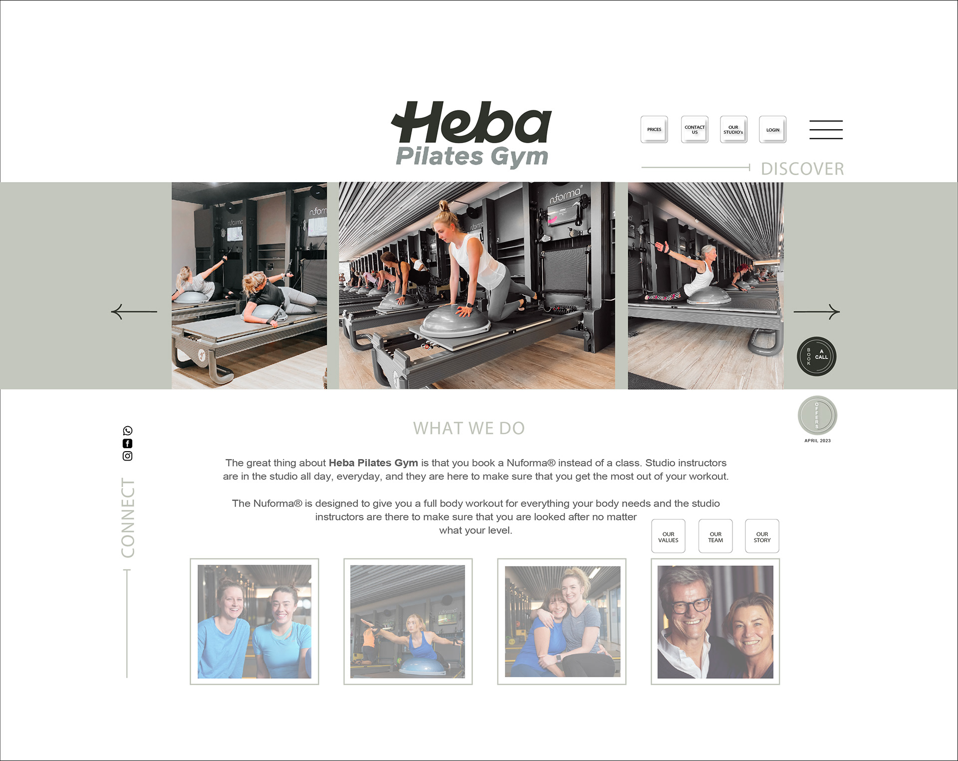
Heba is an existing brand that wanted to update their website to a style that is more contemporary in look and feel, that is lighter/fresher in colour and welcoming for their existing members and target audience.
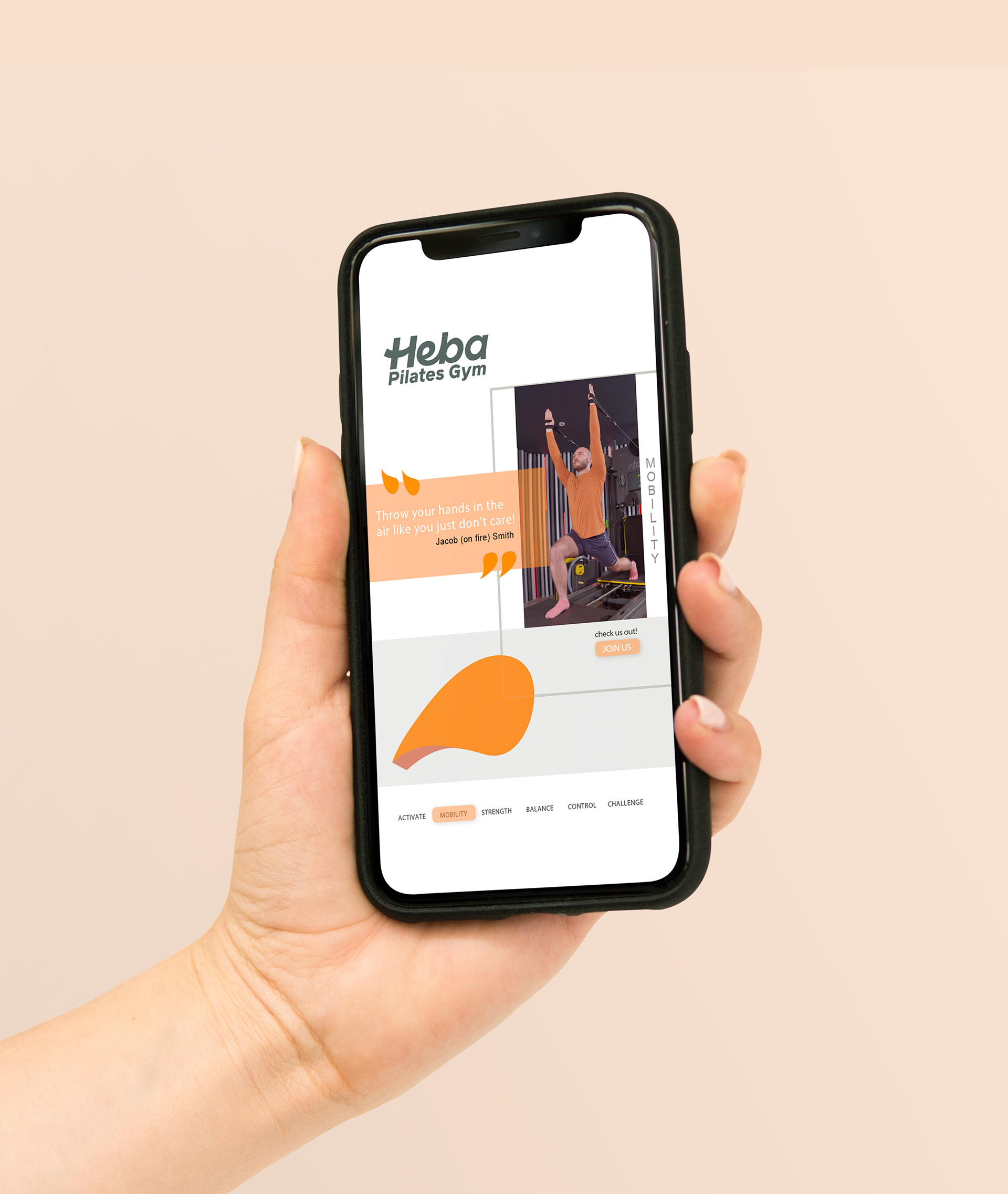
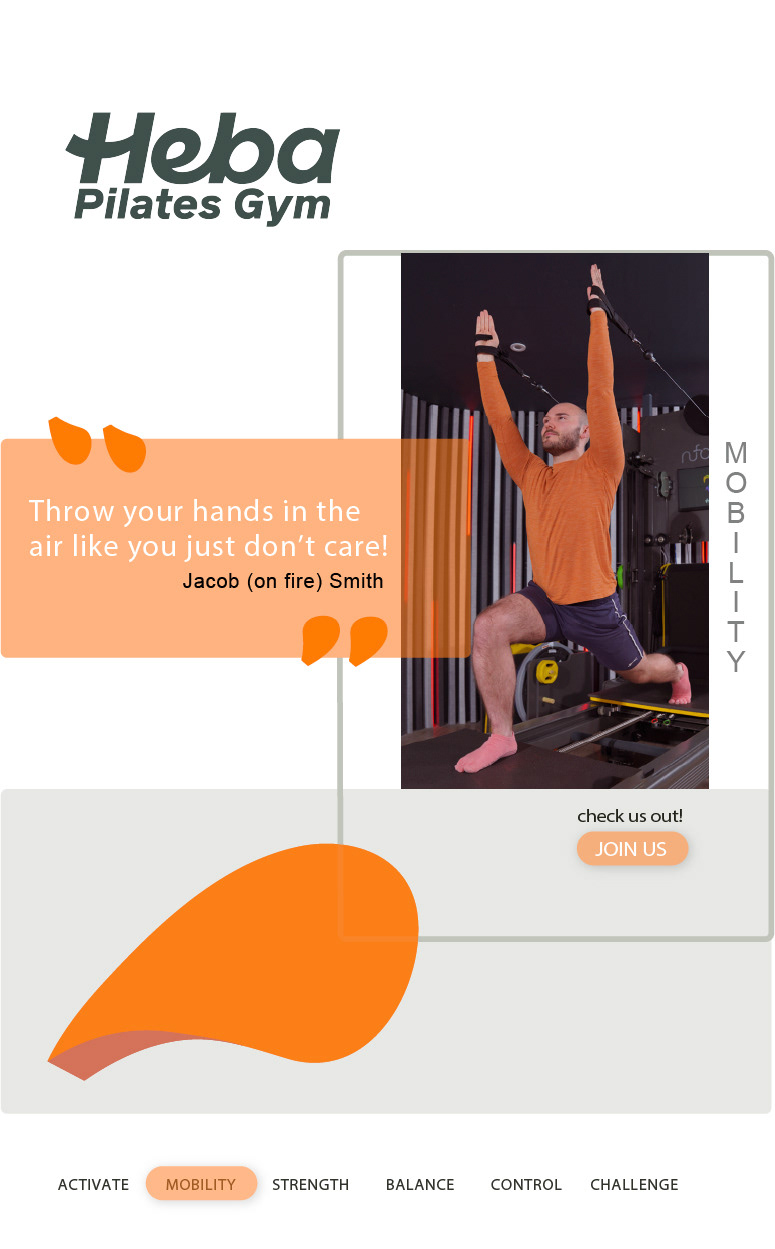
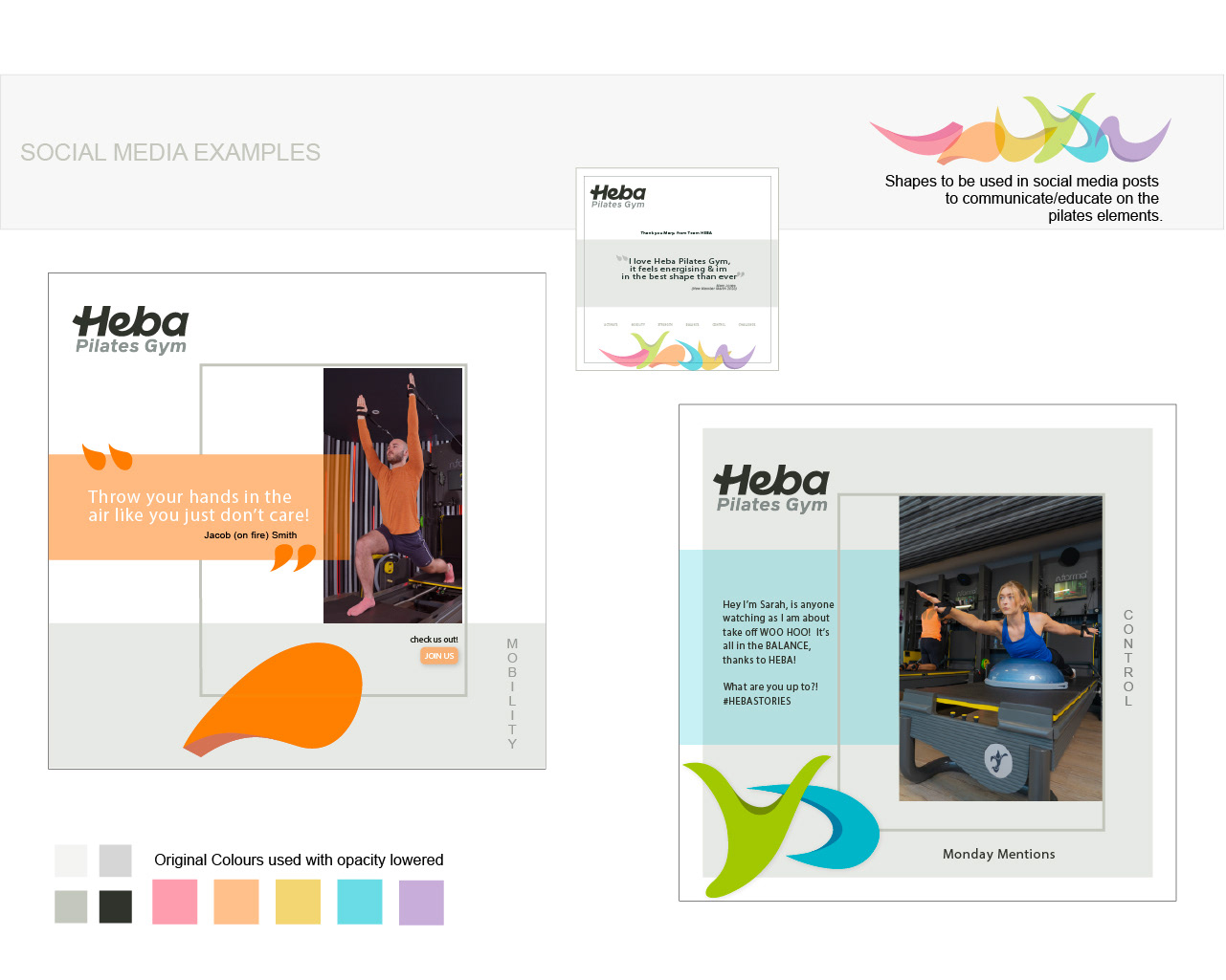
They also wanted to showcase their HEBA flows (see shapes representing this) as depicted here in more subtle tints of colour for the website and the use of brighter versions were developed for their social media marketing.
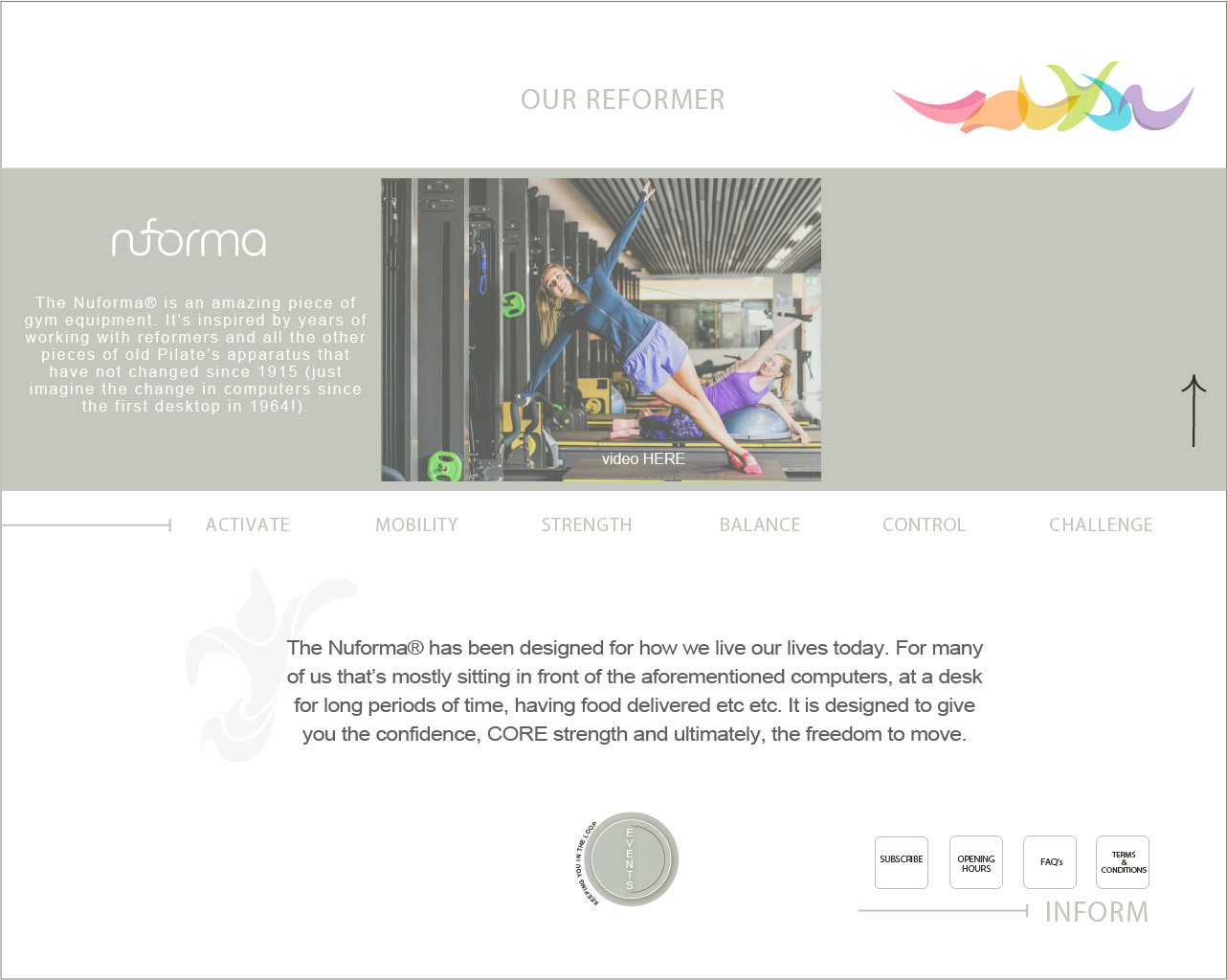
Below is an example of how Heba wanted to showcase their Heba Flows - below is 'Mobility' which is one element of their pilates programme and philosophy that needed this to be consistent across all digital & print assets..