This project was so much fun to do, a Spanish ice cream company required some new branding that was a little glamorous, lively and colourful, they pride themselves on being 100% organic with their products and they use real fruit and real cows!
Hope you like what you see, thanks for reviewing, all comments welcome!
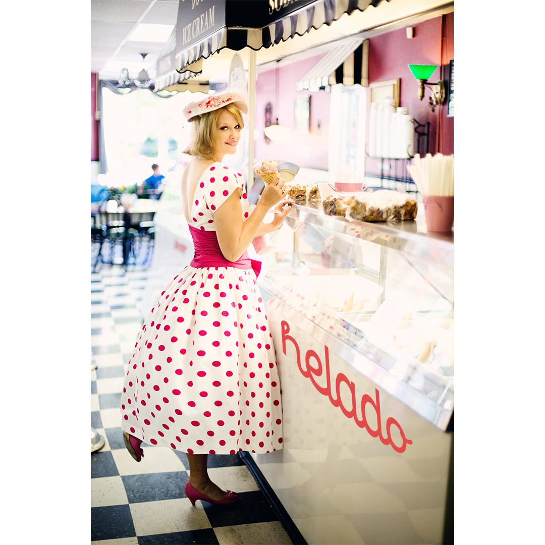
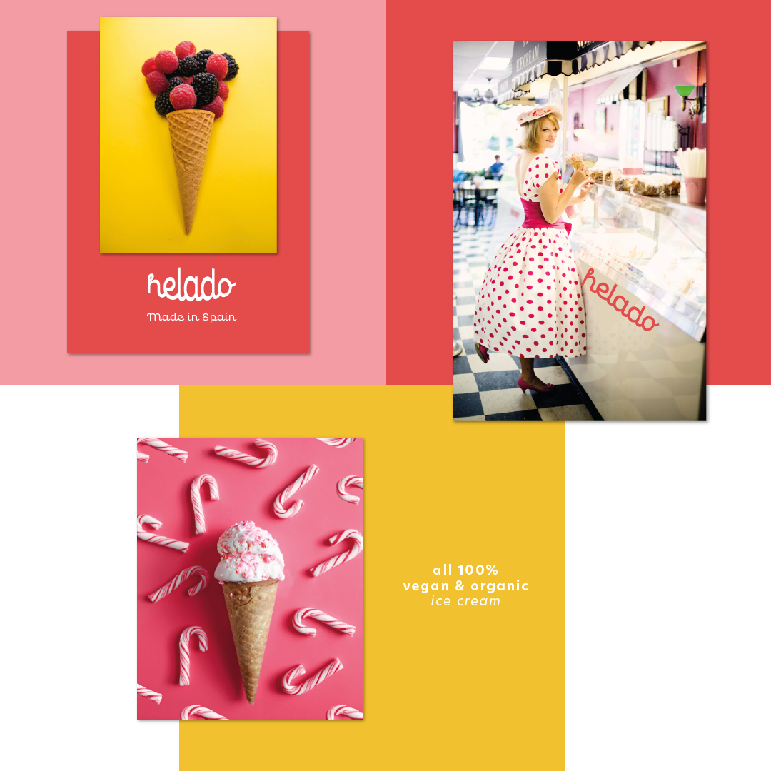
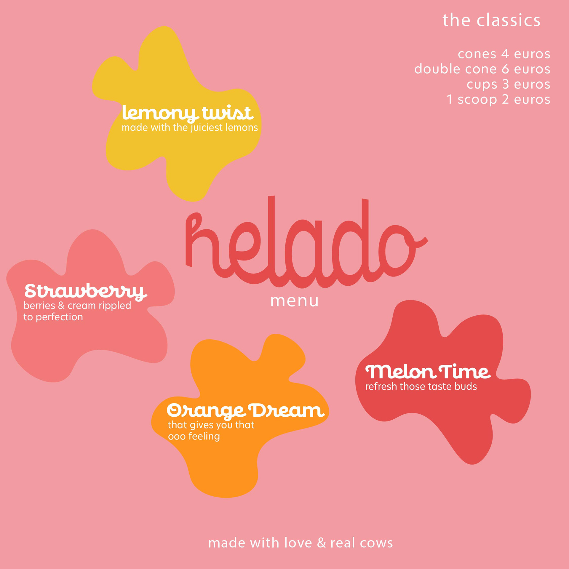
Use of colours to depict ice cream flavours and striking photos to give a sense of occasion when eating something that just makes you go ooooooooooo!
Sample menu
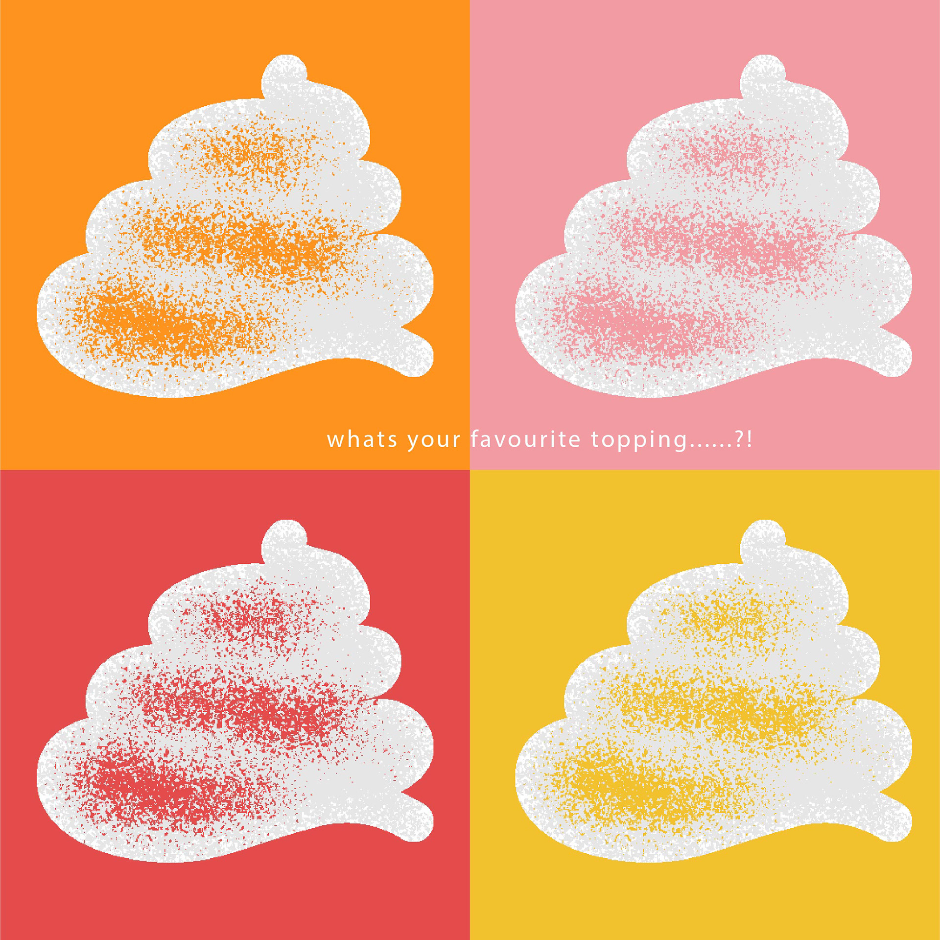
Toppings - whats your flavour?!....orange dream, melon time, strawberry?
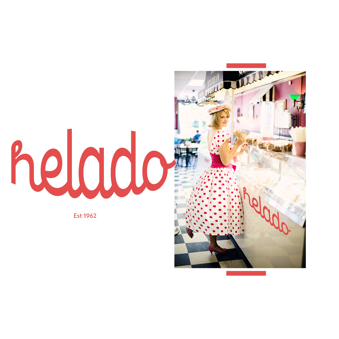
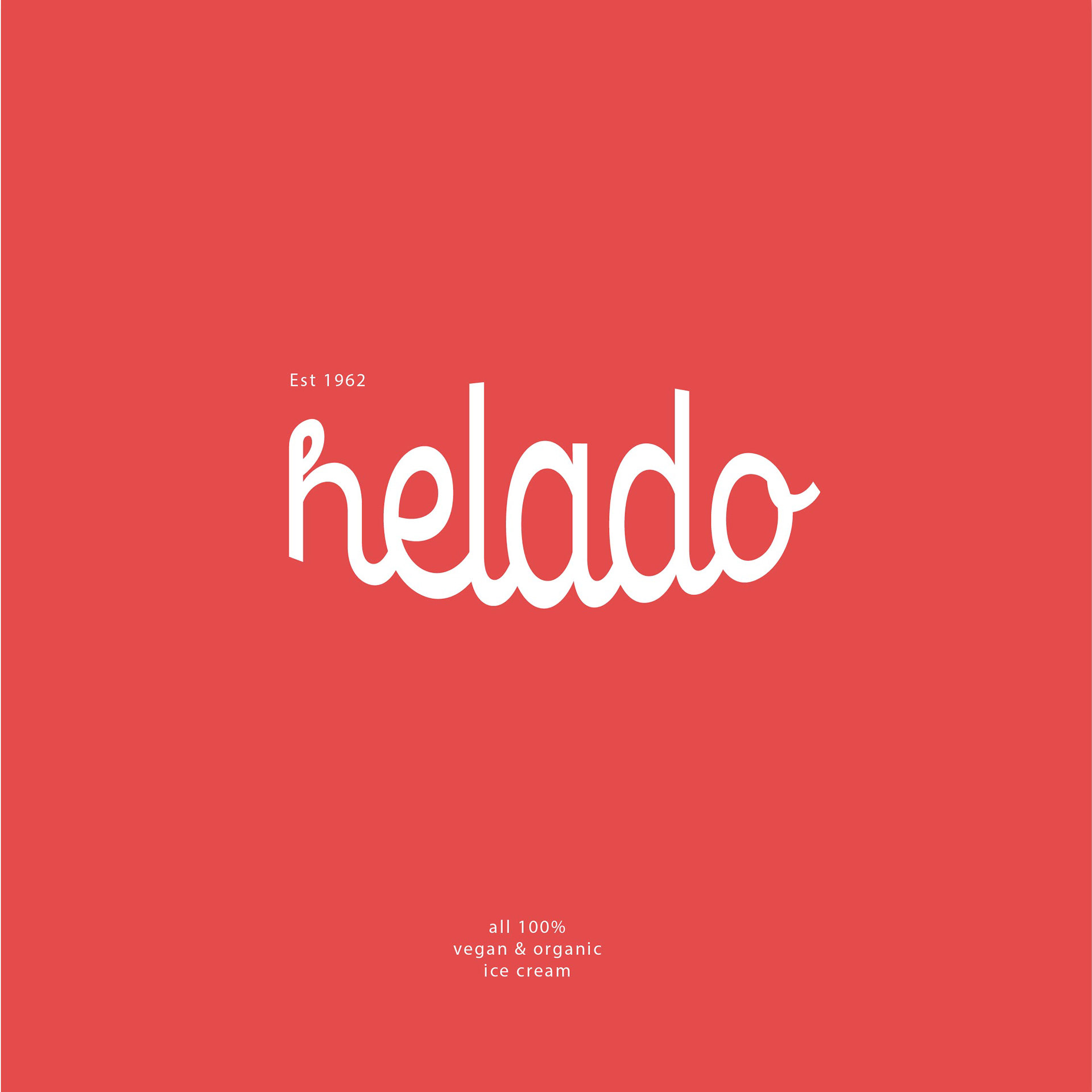
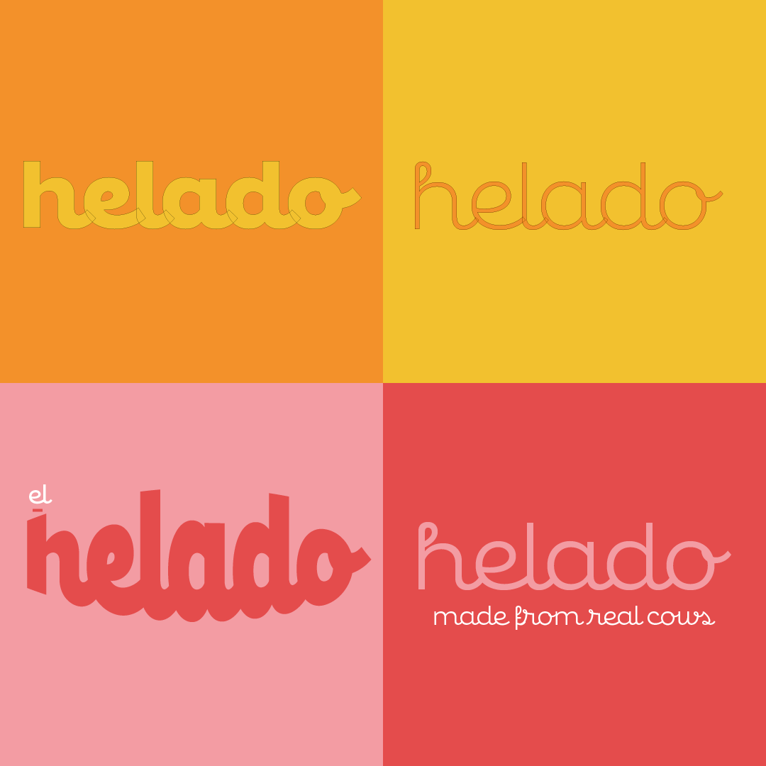
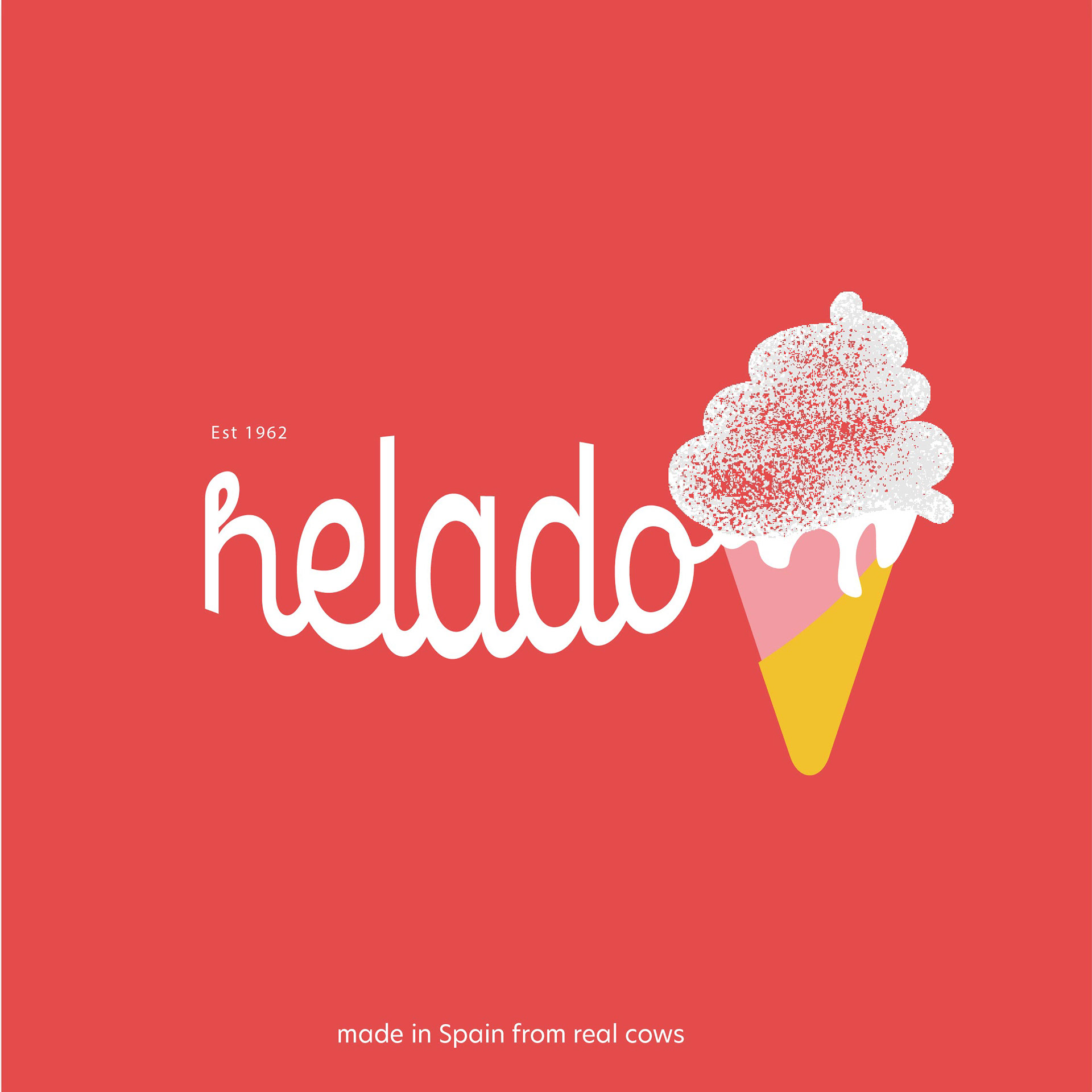
Fonts chosen were based on the flowing lines similar to the fluidity of ice cream, also looks fab in a thin and thick weight.
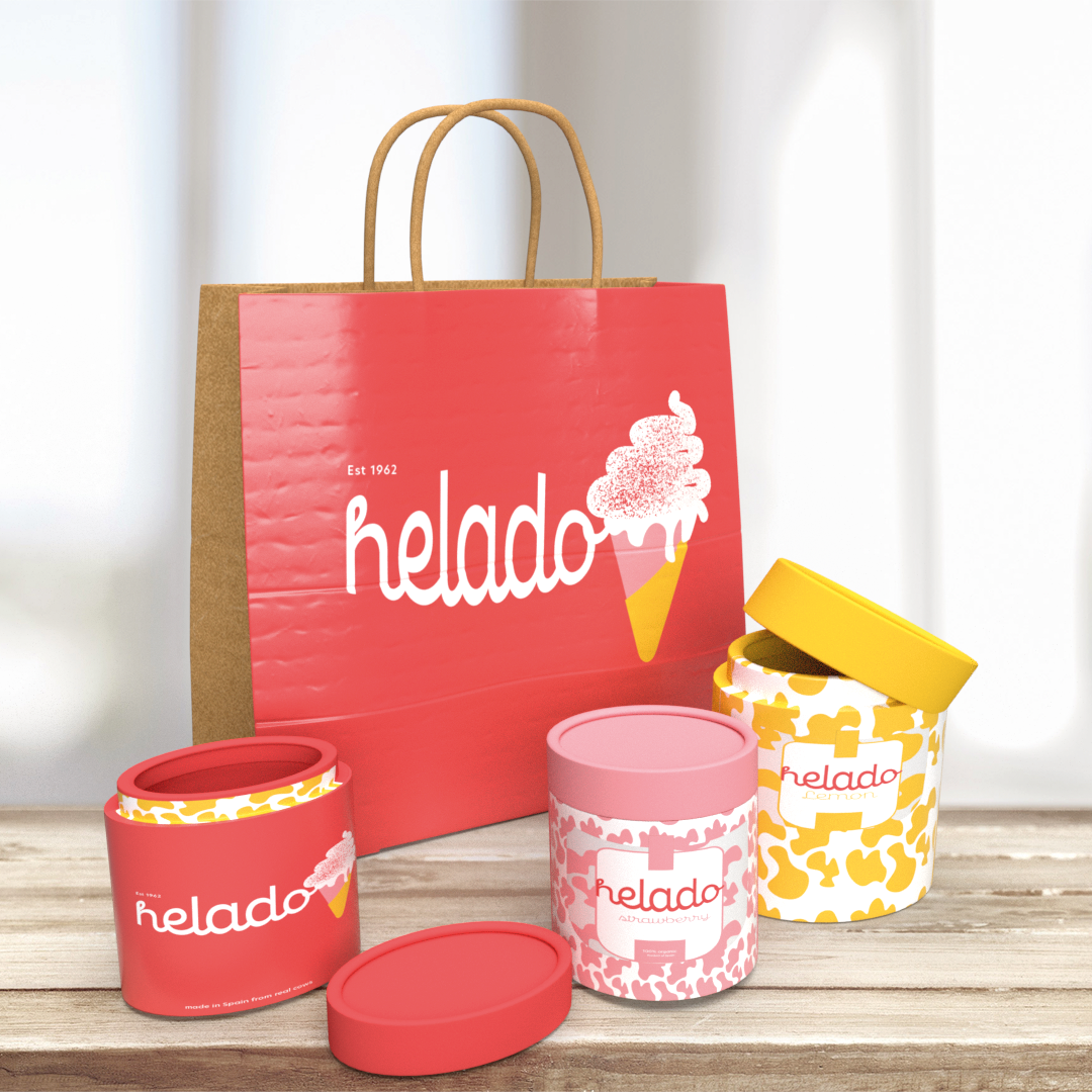
Packaging samples
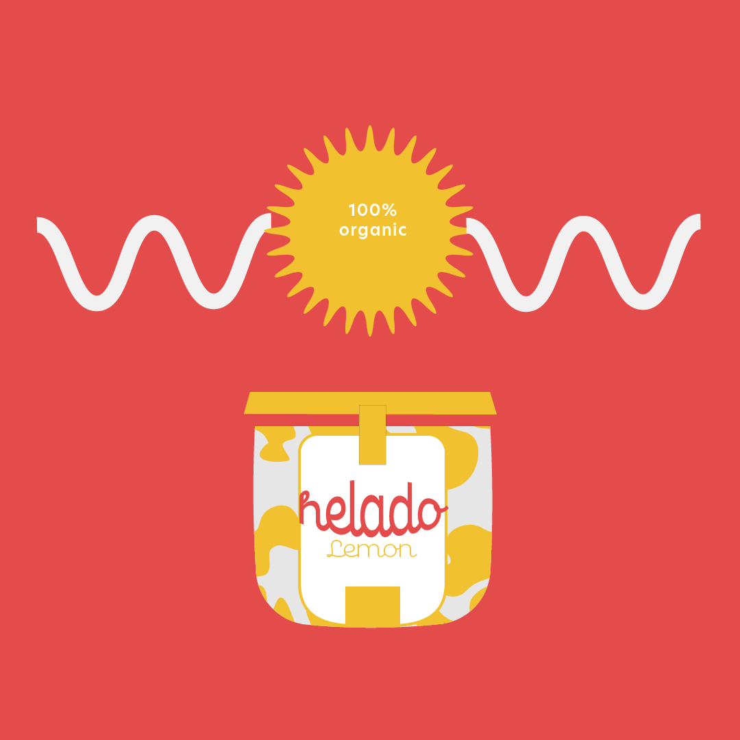
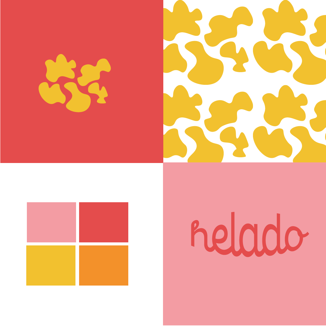
Patterns & colour combo ideas based on colours of Spain & cow print used just because it's an easily recognisable connection to dairy products in general.
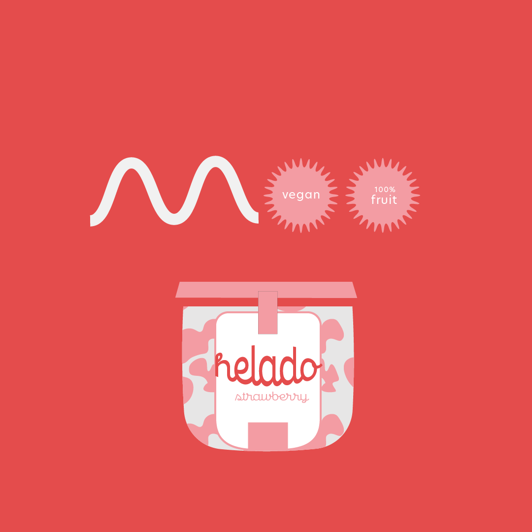
Ideas on labelling, colours match the fruit illustrated so easy to see when buying.
Someone has eaten all the ice cream - never mind just a hint of what the packaging would look like in store.
In store signage