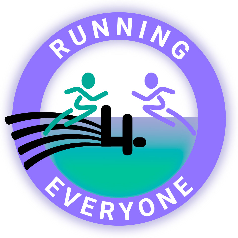
A start up wanted a friendly inviting logo that appealed to all age groups and that was unisex in style and colour. The importance of exercise and the benefits of this both physically and mentally had to be depicted in the overall design. The main characteristics of this logo represent energy flow (glow on outside of logo), the '4' is a link to gears from the left and stepping stones from the right (progress), the runners are also coloured differently to show the coach (left) coachee (right). They are mirroring, meaning that with the right training anyone can reach the same standard.
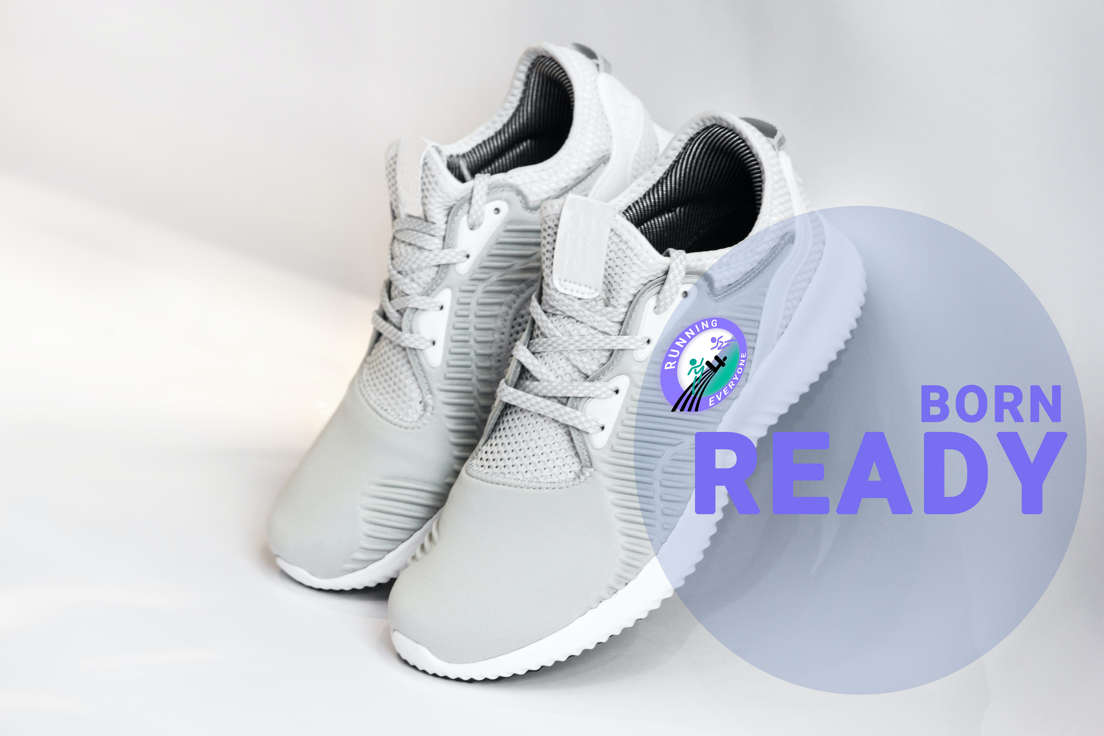
A few examples of how the logo can be placed on assets.

Small details added for consistency across social media, icons used to steer viewer on her instagram page.