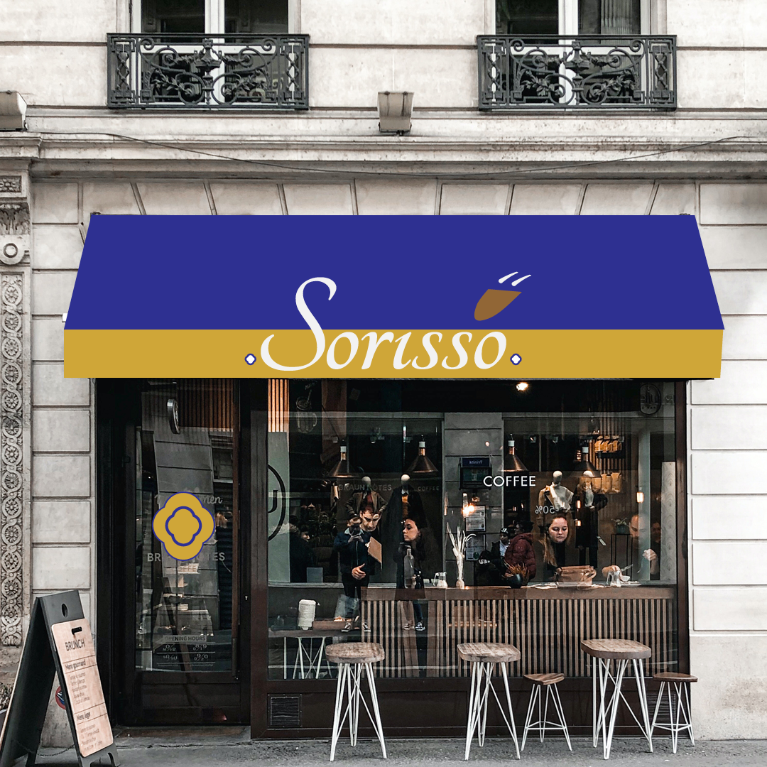
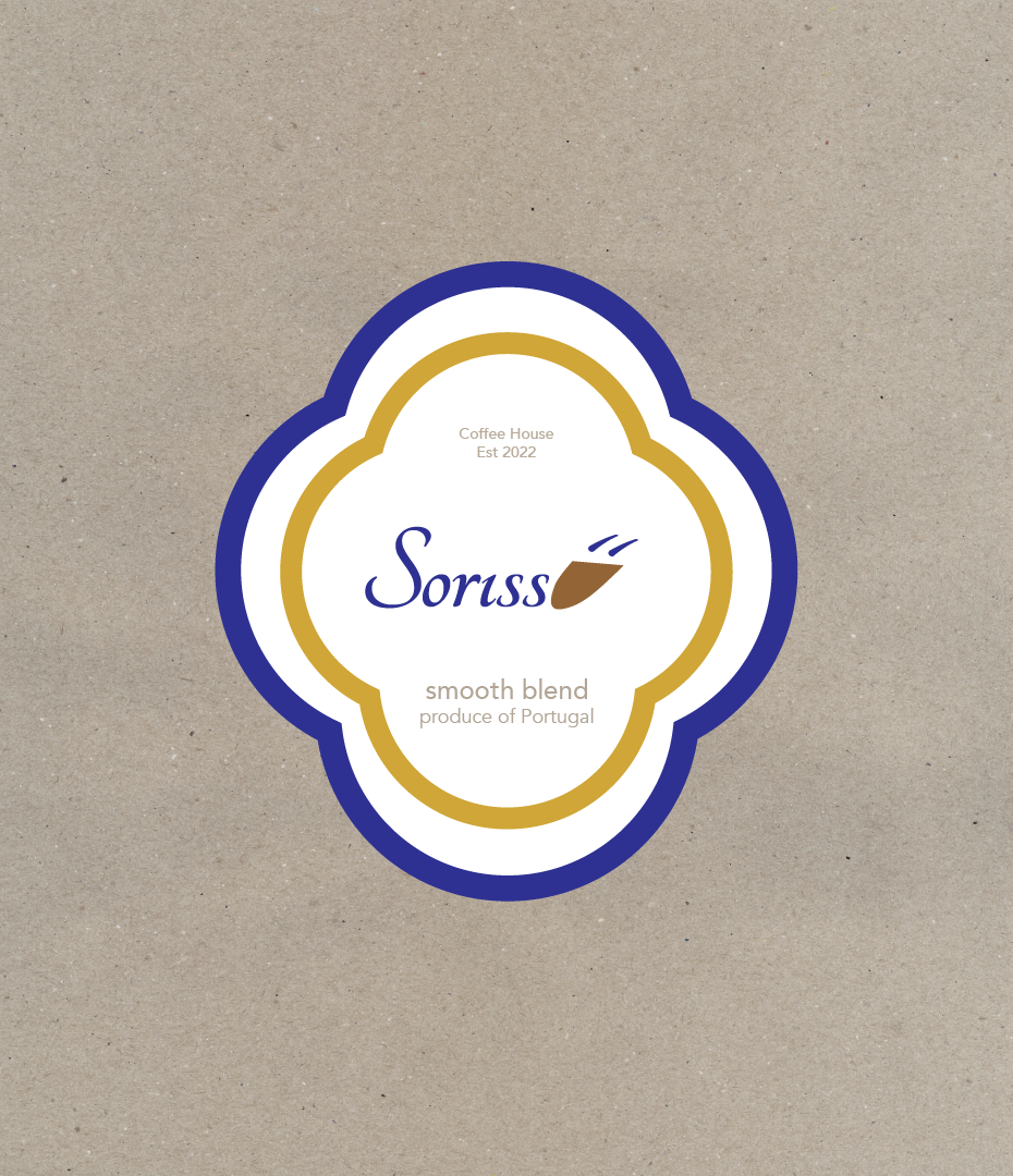
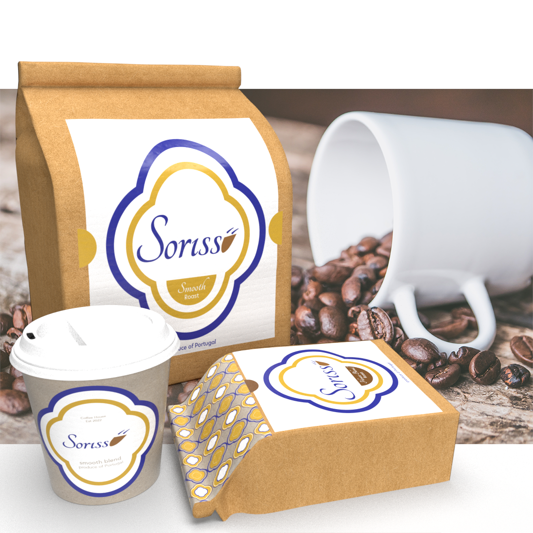
This was a small project based on a portuguese coffee company wanting to brand their own coffee. The brief was to utilise traditional style font and to incorporate the tiles known as 'Azulejo's' which are beautiful ceramic tiles that typically adorn many houses and architectural places of interest throughout their country. After some analysis work it appears that blue & white and blue & yellow are in keeping with this tradition. Whilst the pattern is somewhat modern the font used is more traditional.
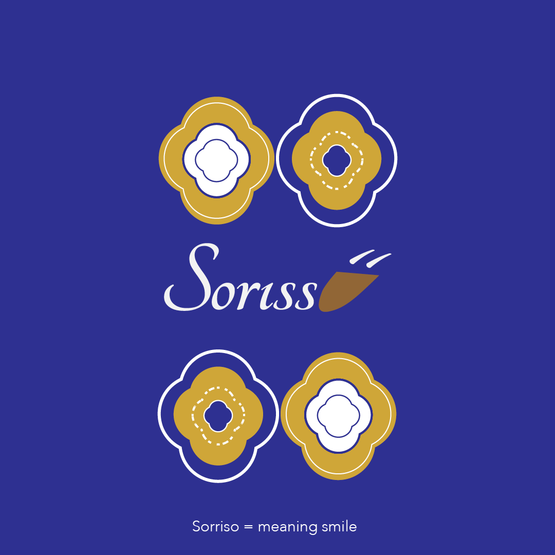
The word Sorisso means smile so they wanted to add this to their overall design.
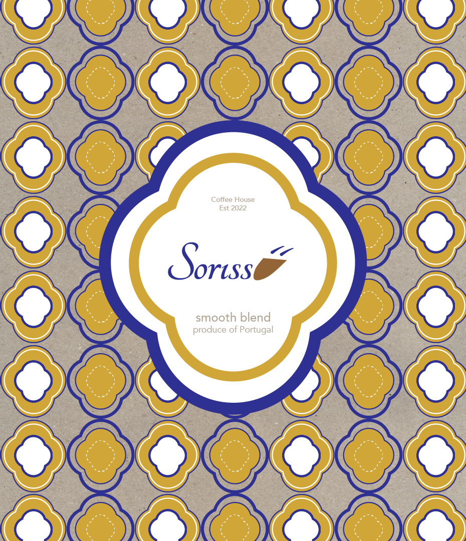
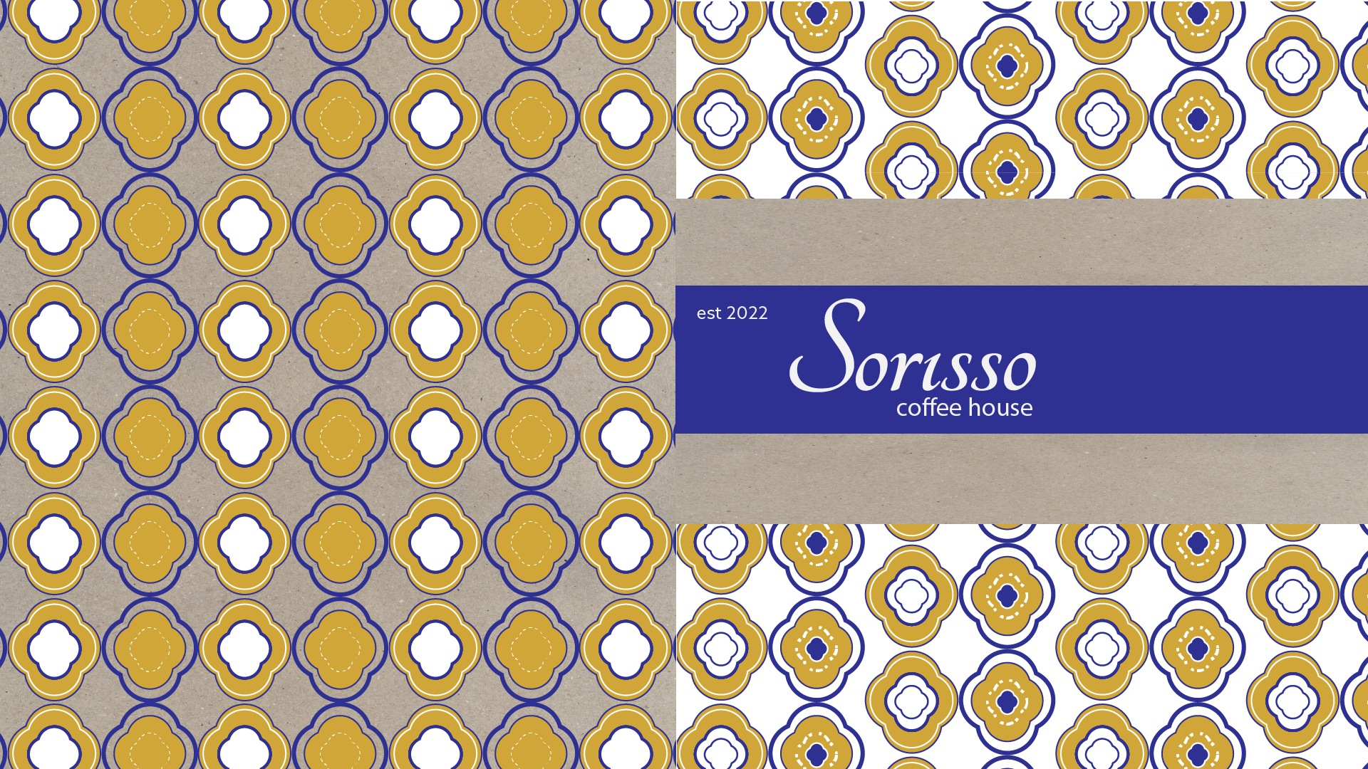
Examples of product labelling
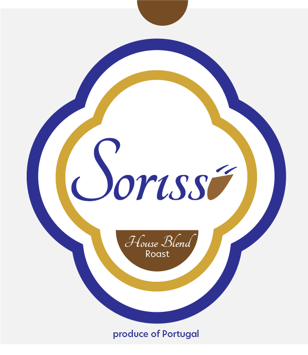
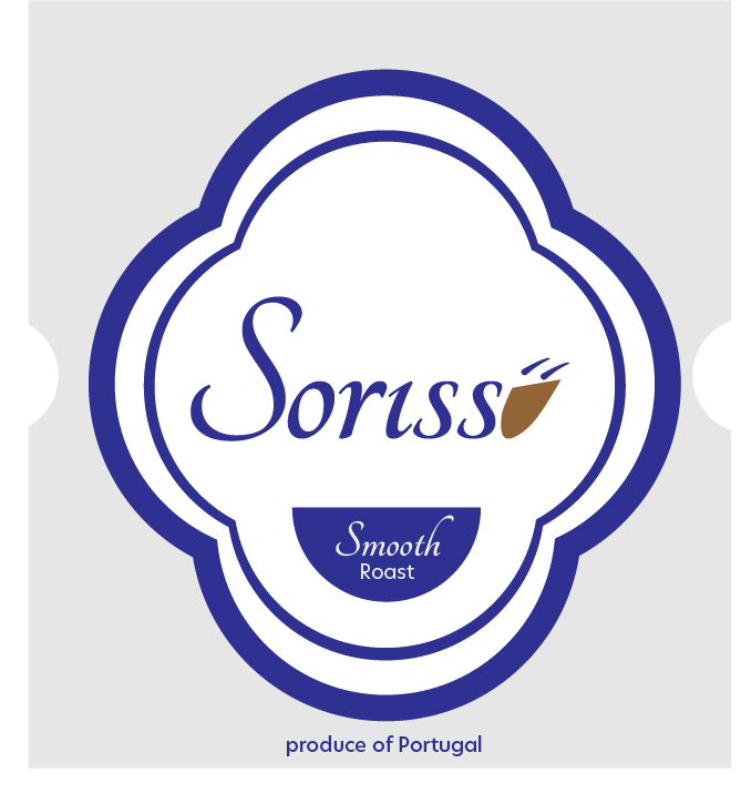
Product Samples
Shop Signage mock up