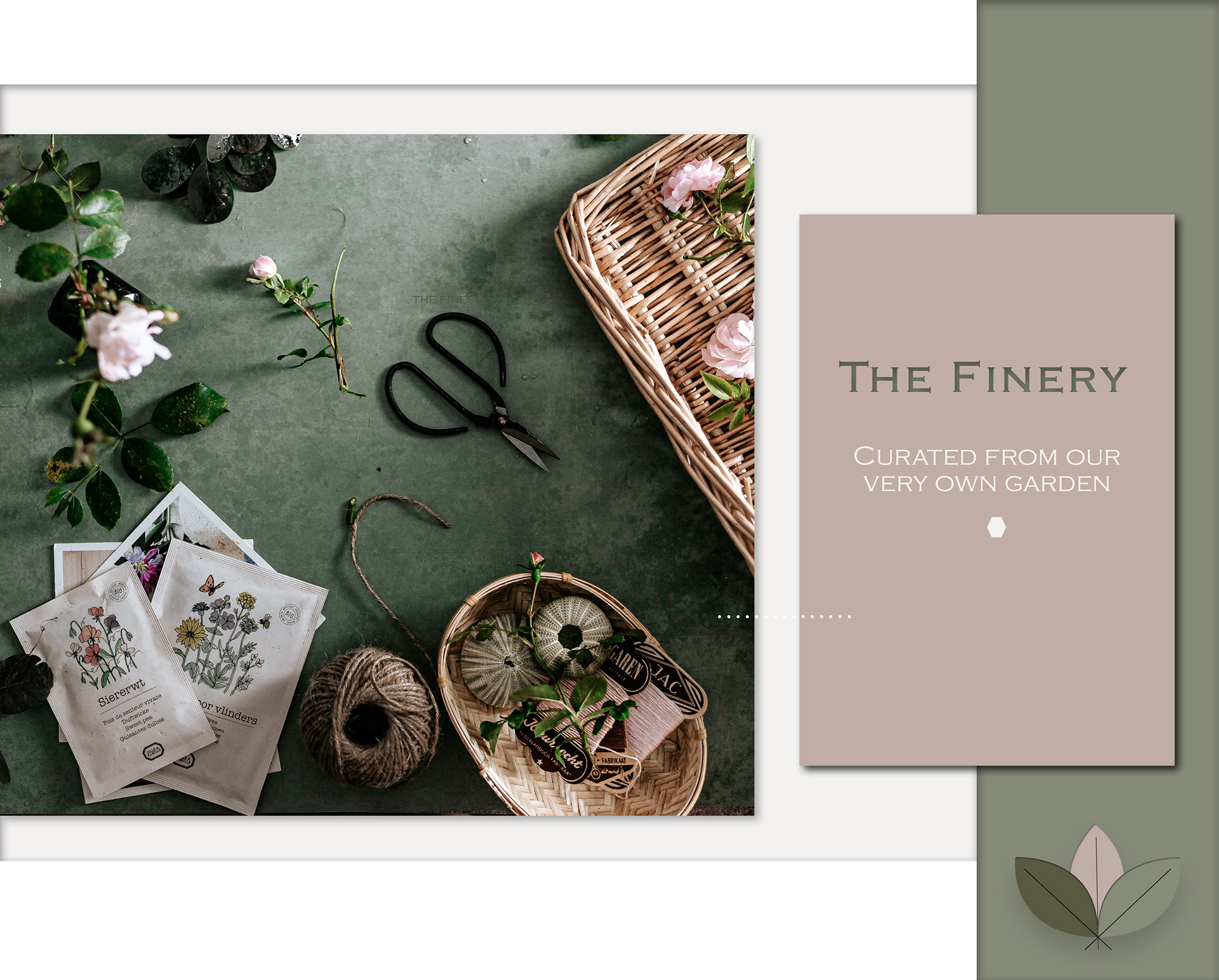
This was my very first project for a small local business that wanted a logo for their new business, producing high quality seasonal handmade fresh flower bouquets & wreaths curated from their very own garden.
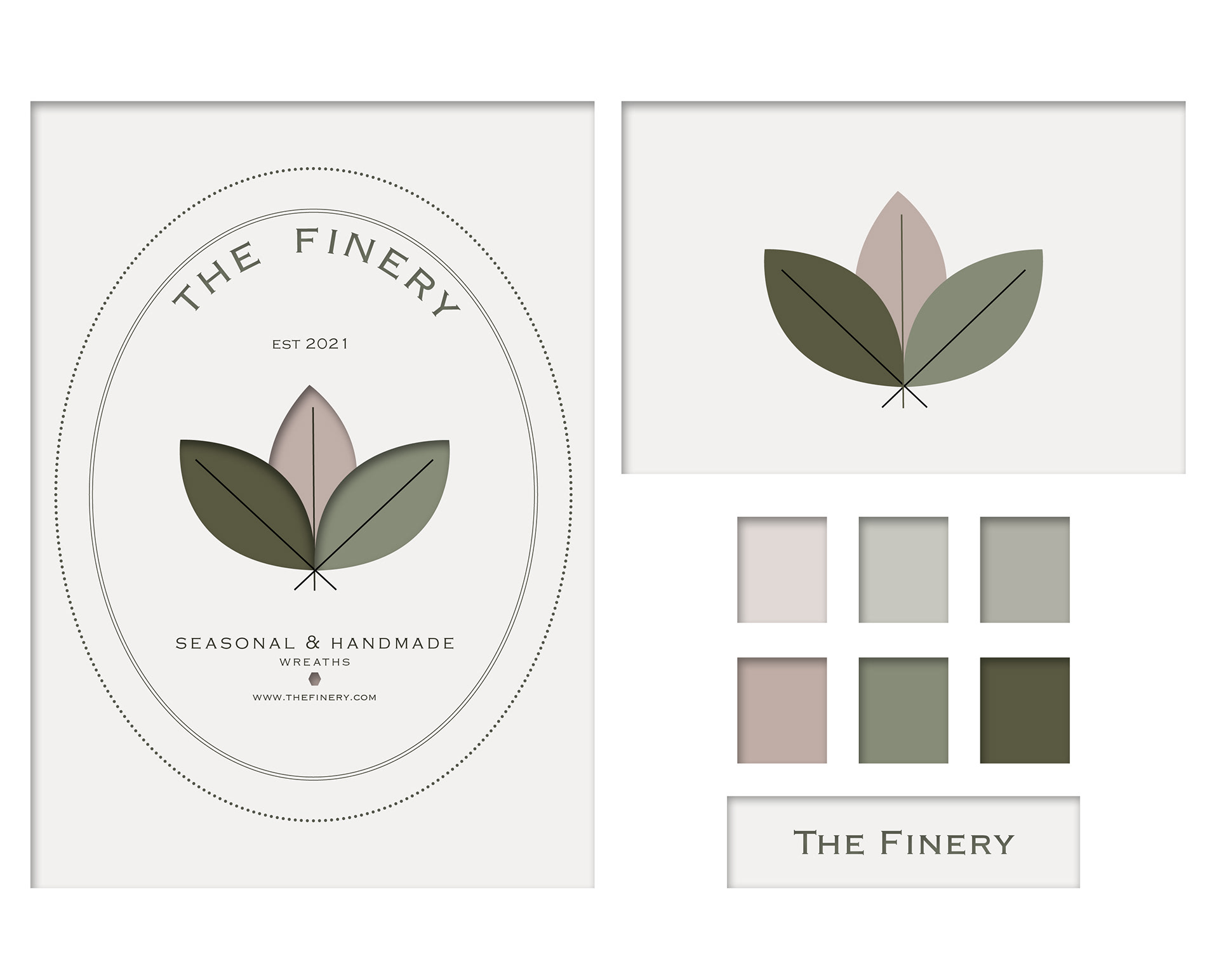
The brief was to ensure the branding illustrated a hint of luxury, quality & organic notes using subtle green and rose colours with a modern twist.
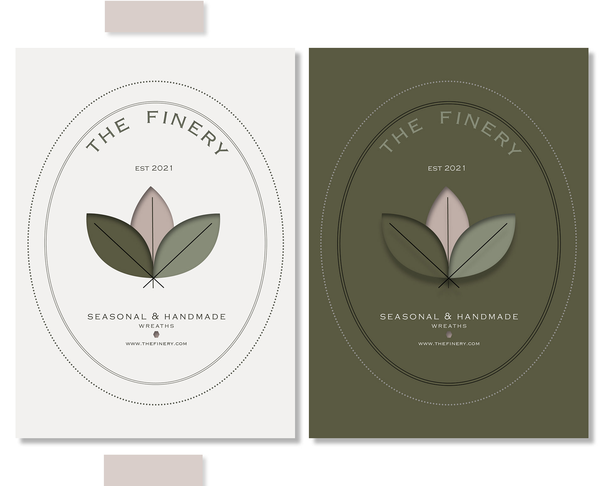
Examples of business card two colour ways.
Product placement examples.
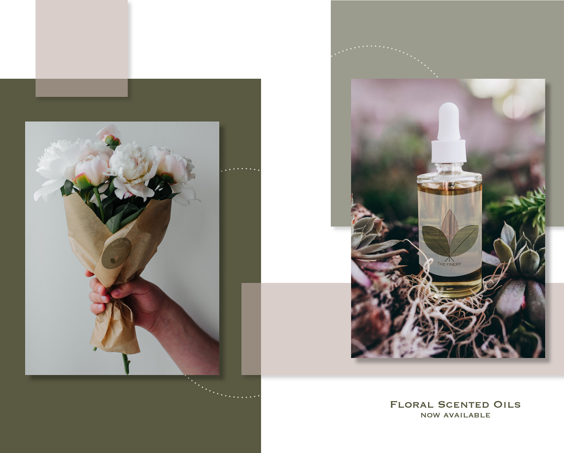
More imagery to showcase logo placement.
Shopfront positioning and look book for customers to view floral arrangements in addition to in store purchases.
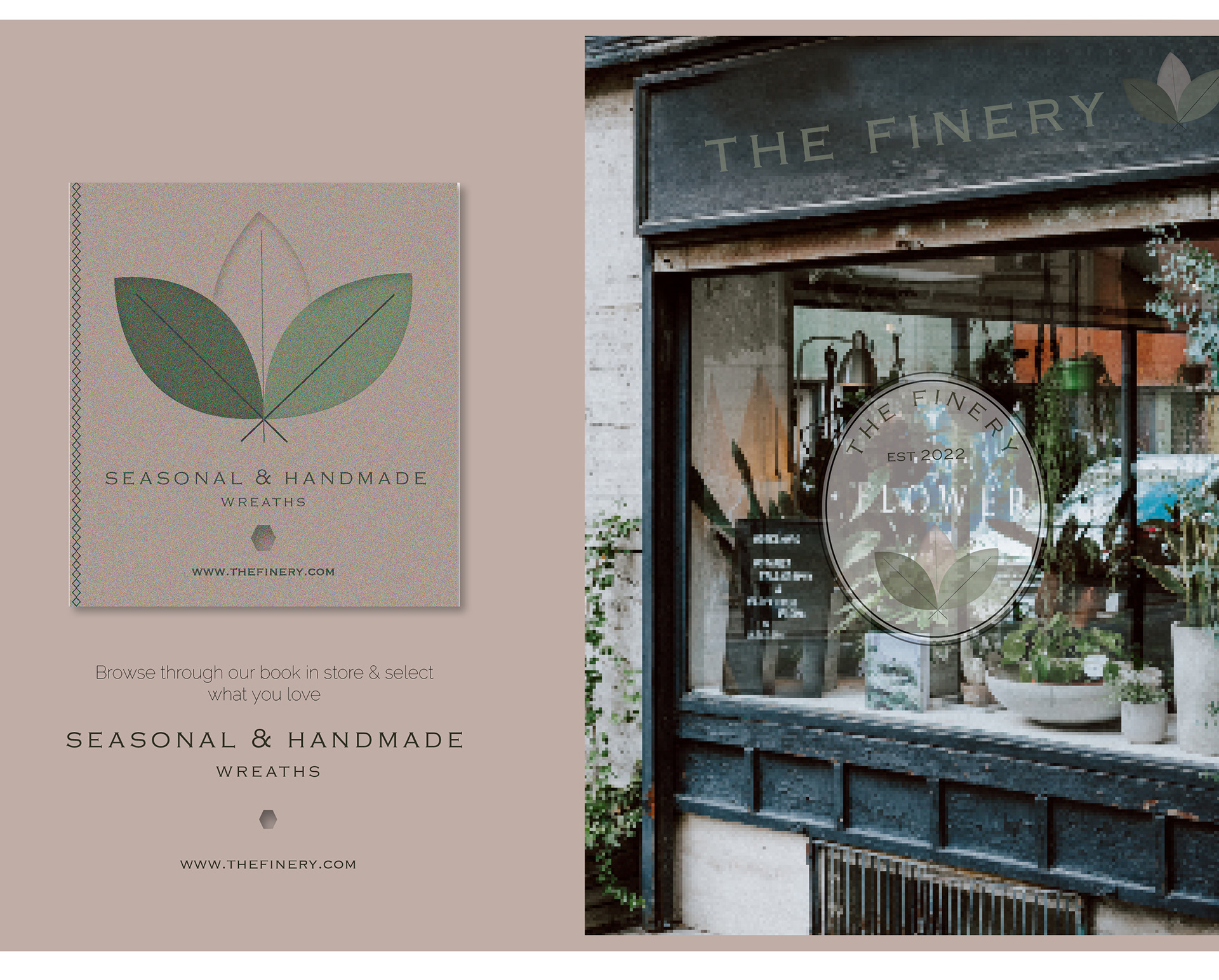
Font chosen is serif, quite traditional, with elegant simple lines that makes is really easy to read without being too fancy as the product (flowers) speak for themselves.
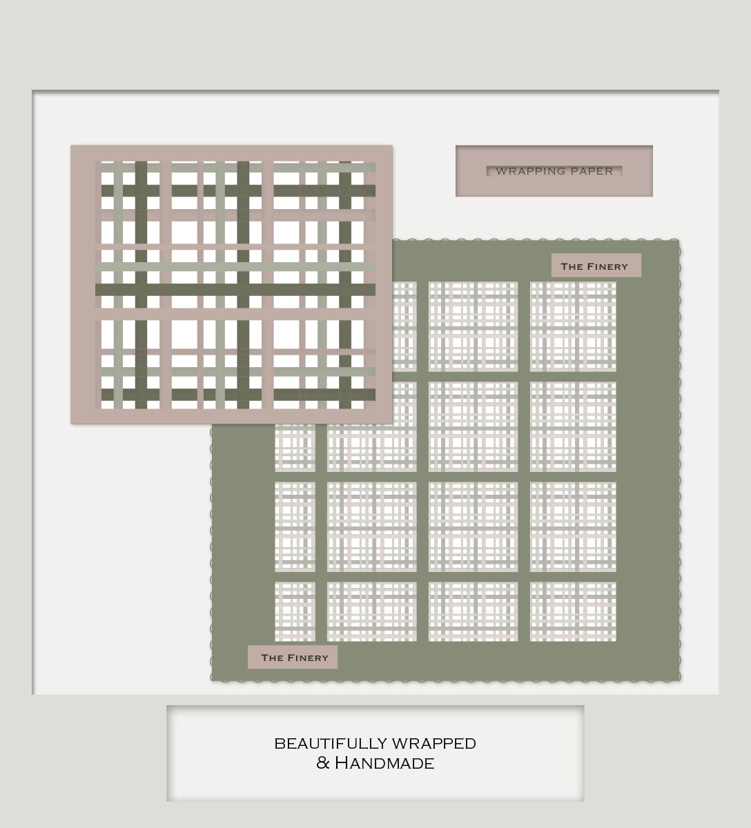
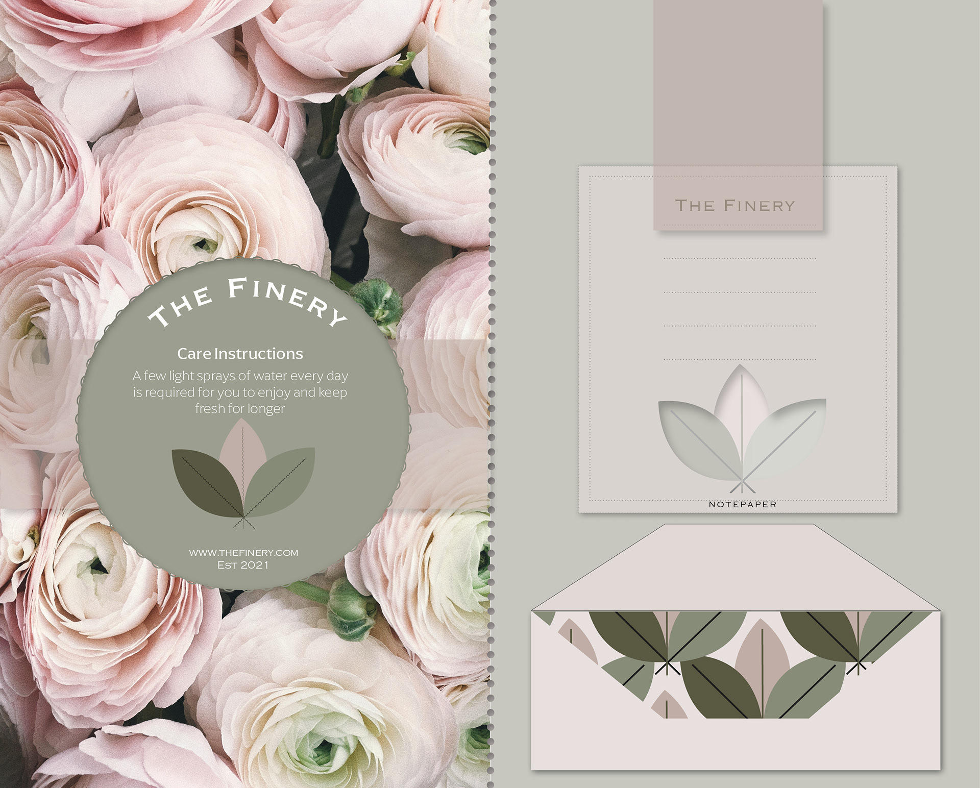
Stationary offering